![]()
Influencia de Vincent en mis Fotografías
![]()
En esta carta, utilizo tus palabras transmitidas al mundo a través de tus cartas, para expresar lo que considero tu concepto sobre algún término que está relacionado con la fotografía, arte que tanto me gusta. Utilizo frases que le enviaste en alguna carta a Theo (T y el número de carta) o en cartas a Will (W con el número). Como hago mención a alguna de tus pinturas, incluyo también el número de catálogo de cada una según haya sido generado por J. de la Faille (F) o por Jan Hulsker (JH).
Como sabes, podemos separar a la fotografía en dos grandes grupos: Fotografía en Blanco y Negro y Fotografía a Color, así como también encontramos dos etapas de tu vida como pintor. La primera, en la que tus cuadros tienen colores oscuros, con mezcla principalmente de tonos grises o colores grisaceos, donde destacan pinturas como las dos versiones de "Los Comedores de Papas" (Pintadas en 1885. F0078/ JH0734, F0082/ JH0764), así como varios de tus "Autorretratos" pintados entre 1886 y 1887 (Ver: Autorretratos (Parte I)).
Posteriormente, viene la etapa de Color en tus pinturas, con aquellas que te han hecho famoso mundialmente. Entre las que más me gustan están:
Al hablar de pintura, incluias descripciones de lo que considerabas sobre los colores, e incluso tu concepto acerca del negro, tan importante en la fotografía: "El negro absoluto no existe, a decir verdad. El negro, como el blanco, existe en casi todos los colores y forma la infinita variación del gris, diferente de tono y de vigor. Y tanto que en la naturaleza no se ve, a decir verdad, otra cosa que esos tonos e intensidades. Los colores fundamentales no son más que tres: rojo, amarillo, azul. El anaranjado, el verde y el violeta son colores 'compuestos'. Por la unión del negro y de un poco de blanco, se producen las variaciones infinitas del gris" (T221), esto es una explicación sencilla de lo que debe expresarse en la combinación de colores y tonos.
Para pintar es necesario saber el resultado de mezclar los colores, algo que también nos puede ser de utilidad al componer nuestra fotografía en color: "Si se combinan dos de los colores primarios, el amarillo y el rojo, por ejemplo, para componer un color binario, el anaranjado, este color binario alcanzará su máximo de brillantez cuanto más se aproxime al tercer color primario no empleado en la mezcla. De igual modo, si se combina el rojo y el azul para producir violeta, este color binario, el violeta, resaltará por la vecindad inmediata del rojo. Se llama con razón complementario, a cada uno de los tres colores primitivos, por relación al color binario que le corresponde. Así el azul es complementario del anaranjado, el amarillo es complementario del violeta, y el rojo complementario del verde. Recíprocamente, cada uno de los colores compuestos es complementario del color primitivo no empleado en la mezcla. Esta exaltación recíproca es lo que se llama la ley del contraste simultáneo" (T401).
Sin embargo, "... el negro y el blanco tienen su razón de ser y su significación, y aquellos que los quieren suprimir, no lo logran" (T428).
Vincent, también describes los colores que nos podemos encontrar en cada una de las estaciones del año: "No es fácil encontrar en el verano un efecto de sol que sea tan rico, tan simple y tan agradable de observar como los efectos característicos de las otras estaciones. La primavera tiene el nuevo trigo verde tierno y los manzanos rosas en flor. El otoño tiene el contraste de las hojas amarillas con los tonos violetas. El invierno tiene la nieve y los menudos personajes negros. Así, pues, si el estío tiene la oposición de los azules con un elemento anaranjado en el bronce dorado de los trigos, se podría hacer justamente de este modo un cuadro que exprese muy bien el aire de las estaciones, con todos los contrastes de los colores complementarios (rojo y verde, azul y anaranjado, amarillo y violeta, blanco y negro)" (T372).
Son estas luces y colores los que modifican nuestra fotografía en cada uno de los meses del año. Vincent, para ti el pintar flores era: "…con la idea de acostumbrarme a usar una escala de colores diferente a la del gris, como son el rosa, verde suave y brillante, azúl claro, violeta, amarillo, naranja y rojo fuerte" (W1). Considero que esta frase es importante para marcar las diferencias entre fotografía en Blanco y Negro o Color.
Ahora bien, tu tema favorito era el hombre y el retrato, según escribiste: "Pero prefiero pintar los ojos de los hombres a las catedrales, porque en los ojos hay algo que no hay en las catedrales, aunque sean majestuosas y se impongan, el último es el alma de un hombre, aunque sea un pobre vagabundo o una persona en la calle, me parece más interesante" (T441). "Lo que me apasiona más -mucho más que el resto de mi trabajo- es el retrato, el retrato moderno" (W22).
Un último comentario que hiciste Vincent, fue: "PUES BIEN, LA VERDAD ES QUE SÓLO PODEMOS HACER QUE SEAN NUESTROS CUADROS LOS QUE HABLEN" (T652).
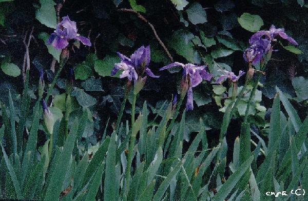
Todo esto que comentas mi querido amigo Vincent, lo podemos extrapolar a la fotografía, por eso te envio una fotografía en la que trato de simular tu cuadro "Lirios" (F0608/ JH1691). Espero sea de tu agrado. En adición, te recomiendo leer las notas publicadas por el New York Institute of Photography, la primera parte trata sobre "Vincent van Gogh (1853-1890): An influence for Photographers".
"Con un fuerte apretón de manos en el pensamiento"
Enrique Pareja.
enpah@yahoo.com
enpa 2001 (Febrero/February)
Expresión
Artística
Vincent's Influence in My Photography
![]()
In this letter, I use your words transmitted worldwide through your letters, to express what I think could be your thoughts about some subjects related with photography, art I like it so much. I use phrases you sent in the letters to Theo (T plus the letter number) or in letters to Will (W plus the number). As I mention some of your paintings, I include the catalogue number as they were developed by J. de la Faille (F) or by Jan Hulsker (JH).
As you know quite well, we can separate photography in two groups: Black and White Photography and Color Photography, as we find two parts of your painting's works. The first one, where your paintings have mainly dark colors or a combination of grayish ones. Your most important paintings of these years are the two paintings named "The Potato Eaters" (Painted in 1885. F0078/ JH0734, F0082/ JH0764), and some of your "Self-Portraits" painted during 1886 and 1887 (See: Self-Portaits (Part I)).
Lately, your Colorful paintings stage, those that you has made famous worldwide. The most I like are:
When you talked about painting, you included descriptions of which you considered on colors, and your thoughts about the black, so important in photography: "Absolute black does not really exist. But like white, it is present in almost every colour, and forms the endless variety of greys, - different in tone and strength. So that in nature one really sees nothing else but those tones or shades. There are but three fundamental colours – red, yellow and blue; "composites" are orange, green and purple. By adding black and some white one gets the endless varieties of greys - red grey, yellow-grey, blue-grey, green-grey, orange-grey, violet-grey. To say, for instance, how many green-greys there are is impossible; there are endless varieties" (T221), this is a very simple explanation of what somebody must express with colors combination.
To paint it is necessary to know how to mix the colours, something useful to get our photos in color. "If one combines two of the primary colours, for instance yellow and red, in order to produce a secondary colour – orange – this secondary colour will attain maximum brilliancy when it is put close to the third primary colour not used in the mixture. In the same way, if one combines red and blue in order to produce violet, this secondary colour, violet, will be intensified by the immediate proximity of yellow. And finally, if one combines yellow and blue in order to produce green, this green will be intensified by the immediate proximity of red. Each of the three primitive colours is rightly called complementary with regard to the corresponding secondary colours. Thus blue is the complementary colour of orange; yellow, the complementary colour of violet; and red, the complementary colour of green. Conversely, each of the combined colours is the complementary colour of the primitive one not used in the mixture. This mutual intensification is what is called the law of simultaneous contrast" (T401).
However, "... black and white have their reason and significance, and when one tries to suppress them, it turns out wrong; " (T428).
Vincent, you describes the colors we could find in any season of the year: "It would be a thing that gave a good impression of summer. I think summer is not easy to express; generally, at least often, a summer effect is either impossible or ugly, at least I think so, but then, as opposition, there is the twilight. But I mean to say that it is not easy to find a summer sun effect which is as rich and as simple, and as pleasant to look at as the characteristic effects of the other seasons. Spring is tender, green young corn and pink apple blossoms. Autumn is the contrast of the yellow leaves against violet tones. Winter is the snow with black silhouettes. But now, if summer is the opposition of blues against an element of orange, in the gold bronze of the corn, one could paint a picture which expressed the mood of the seasons in each of the contrasts of the complementary colours (red and green, blue and orange, yellow and violet, white and black)" (T372).
These colors and lights are which modify our photography during each month of the year. Vincent, for you, to paint flowers was but "...to get used to colours other than grey, vis. pink, soft or bright green, light blue, violet, yellow, orange, glorious red" (W1). I consider this phrase is very important to get the differences between Blank and White and Color Photography.
On the other hand, your favorite painting' subject was the man and the portrait, as you explained: "But I prefer painting people's eyes to cathedrals, for there is something in the eyes that is not in the cathedral, however solemn and imposing the latter may be – a human soul, be it that of a poor beggar or of a streetwalker, is more interesting to me" (T441). "What impassions me most--much, much more than all the rest of my métier--is the portrait, the modern portrait" (W22).
And one of your last thoughts was: "WELL, THE TRUTH IS, WE CAN ONLY MAKE OUR PICTURES SPEAK"(T652).
My dearest friend Vincent, I think all your comments could be extrapolated to photography, though I like to send you with this letter a photo I took trying to copy your painting: "Irises" (F0608/ JH1691). I hope you like it. Additionally, I recommend you to read the notes prepared by the New York Institute of Photography, first one explains some about "Vincent van Gogh (1853-1890): An influence for Photographers".
"With a handshake in thought"
Enrique Pareja.
enpah@yahoo.com
enpa 2001 (Febrero/February)
Expresión
Artística
BIBLIOGRAFÍA/BIBLIOGRAFÍA